Project: Branding Inigo
Creative Film Company Identity Design
Creative Film Company Identity Design
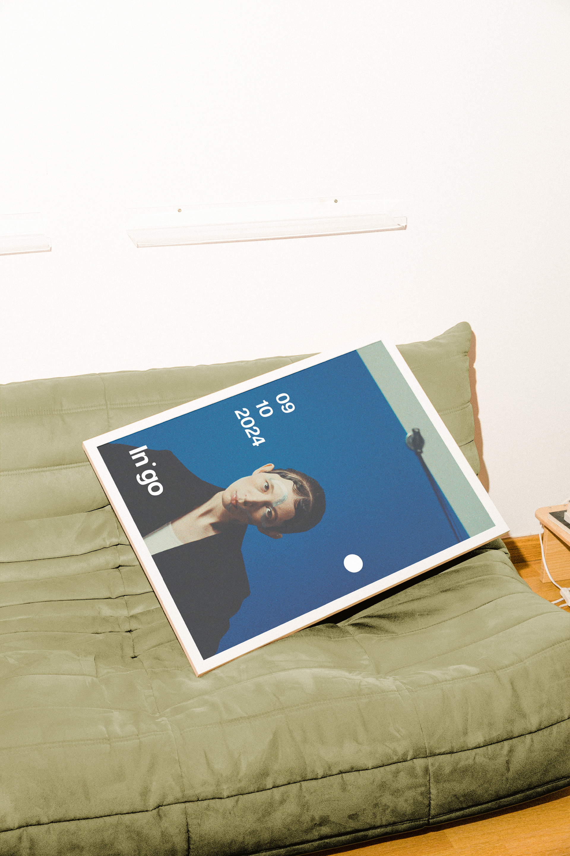
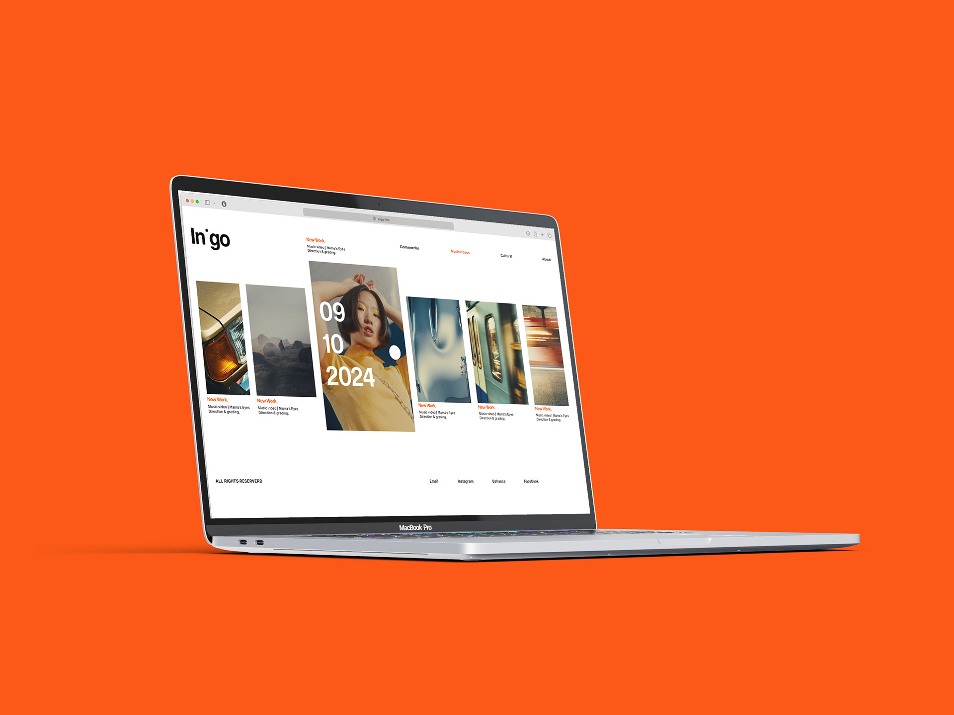
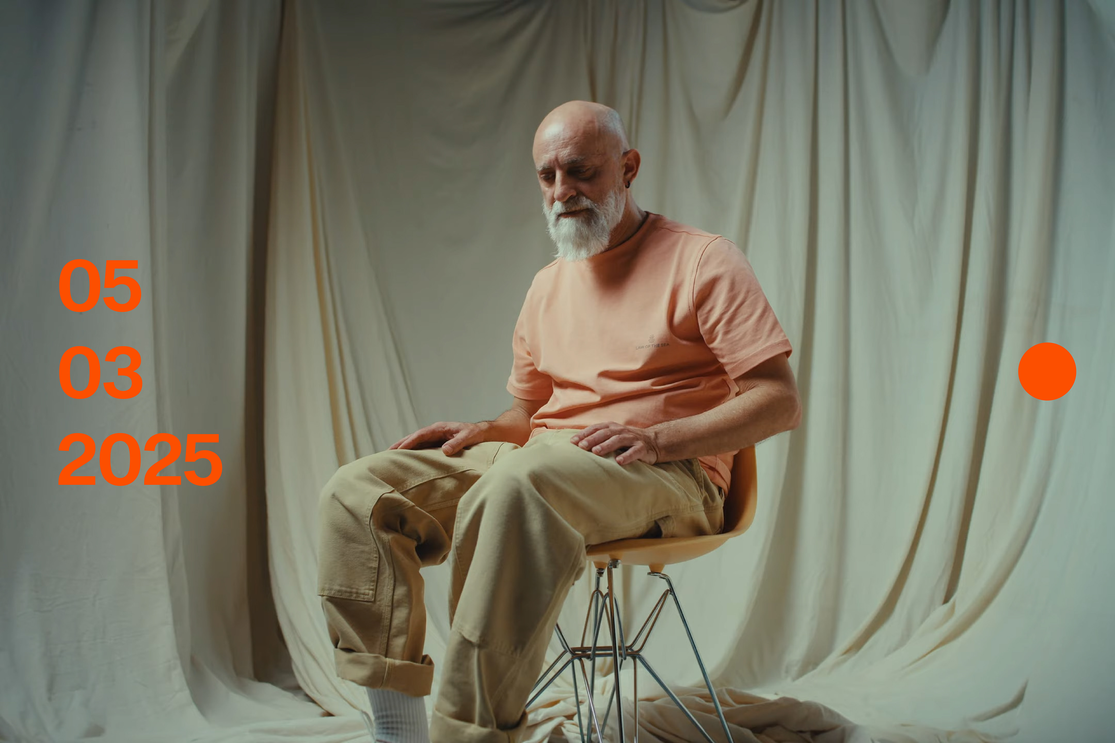
Inigo is a creative film company that captures stories with fire, quite literally. Named after the Latin word for fiery, Inigo produces visual work for artists, fashion labels, design studios, and other creative industries that dare to stand out. The two founders bring a relentless drive to the table, and the identity needed to reflect exactly that.
So, I built a branding system around motion and authorship. The key visual mark? A simple dot always leaning forward. It’s placed consistently on the right side of each piece of content, symbolizing their forward momentum. On the opposite end, the date of creation is always visible transforming every frame into a timestamped piece of their growing archive.
With this structure, every output by Inigo becomes a living part of their brand. The identity is the portfolio. Anything Inigo touches is art, and the brand makes sure you never forget who made it and when.
From logo to layout principles, this system was designed to be as dynamic and intentional as their work ethic. Minimal, but never passive. A bold statement in motion.