Maya Maria – Artist Branding
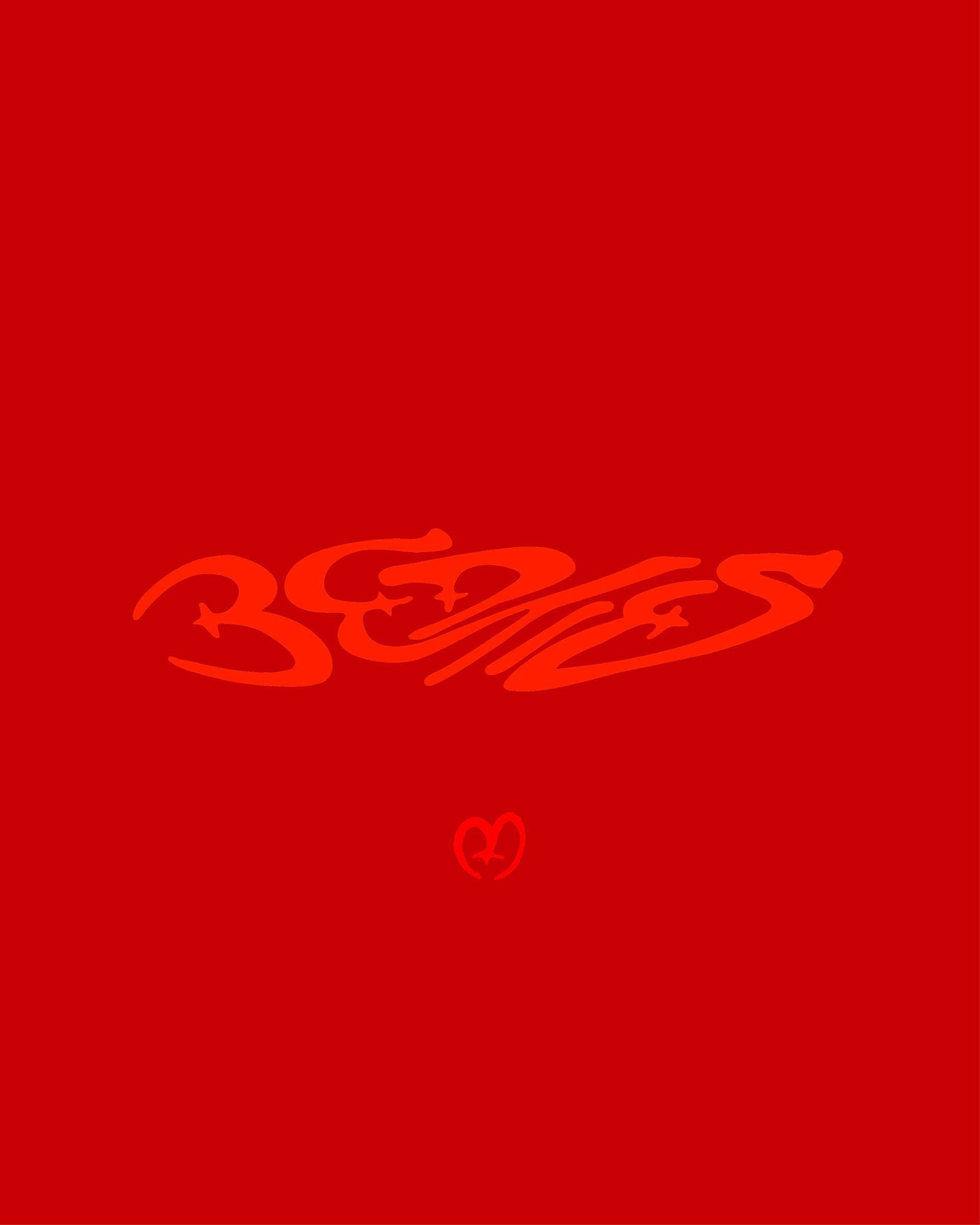
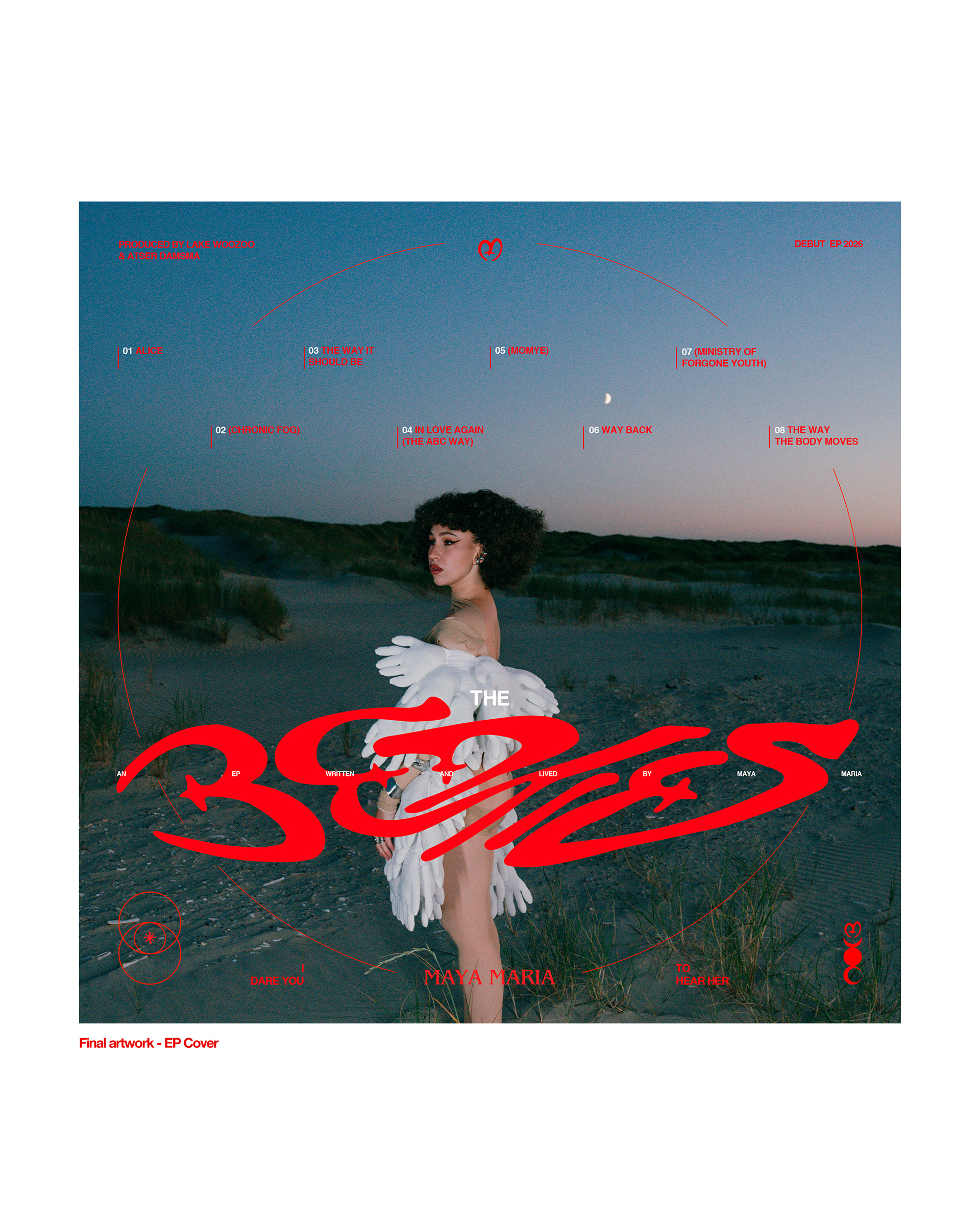
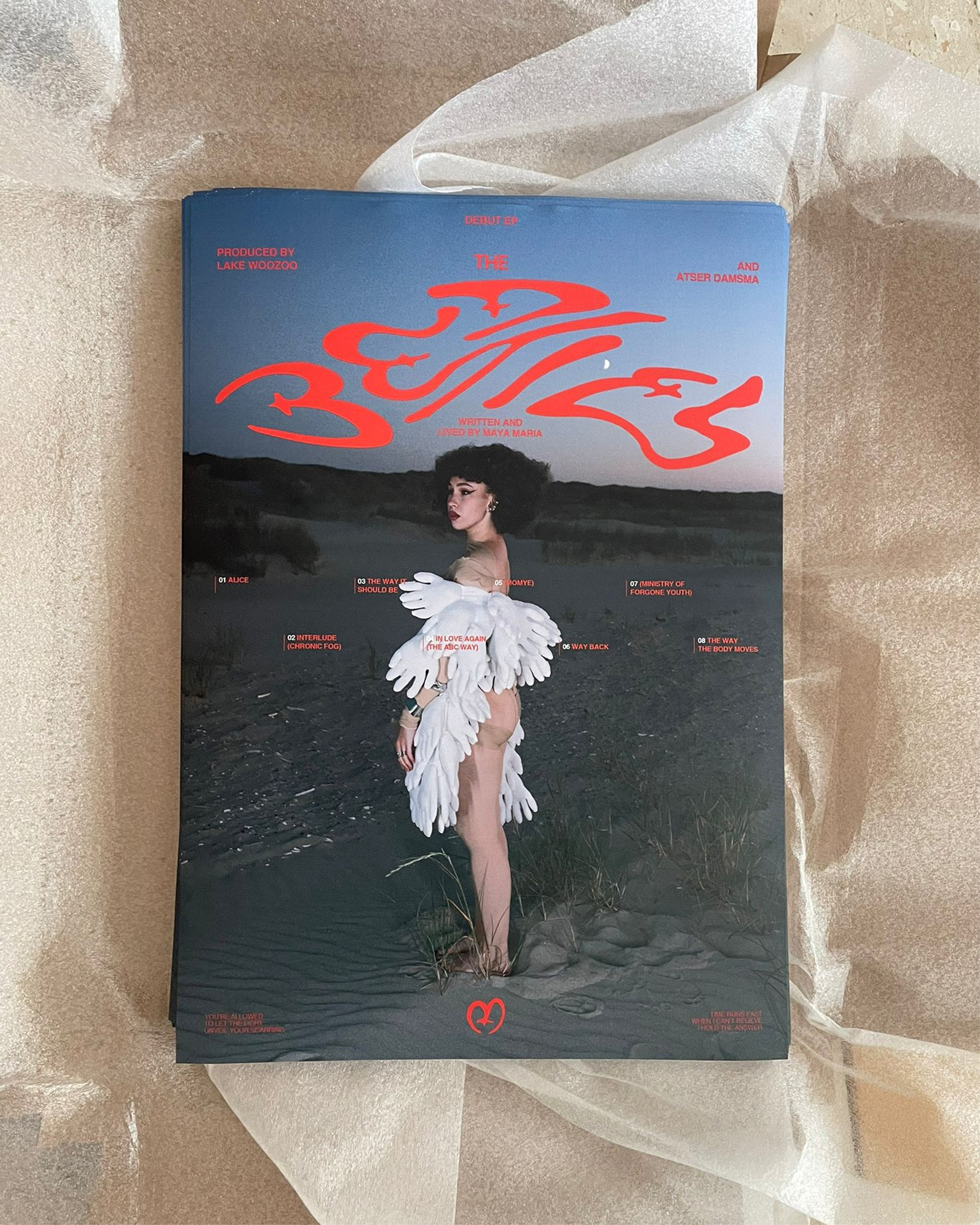
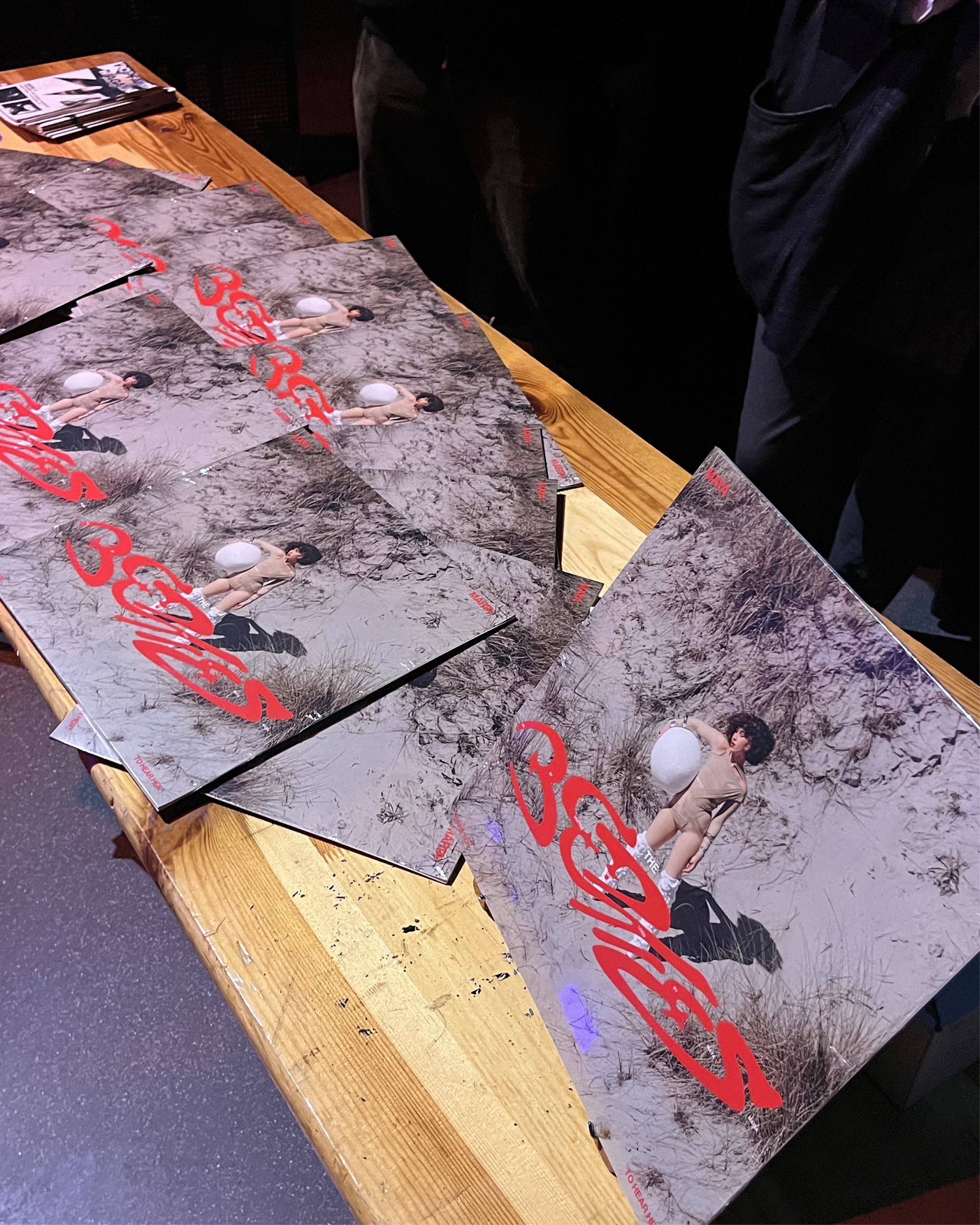
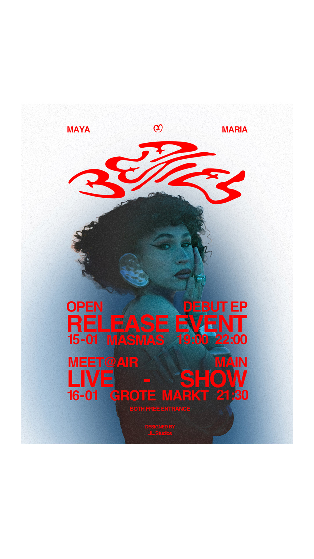
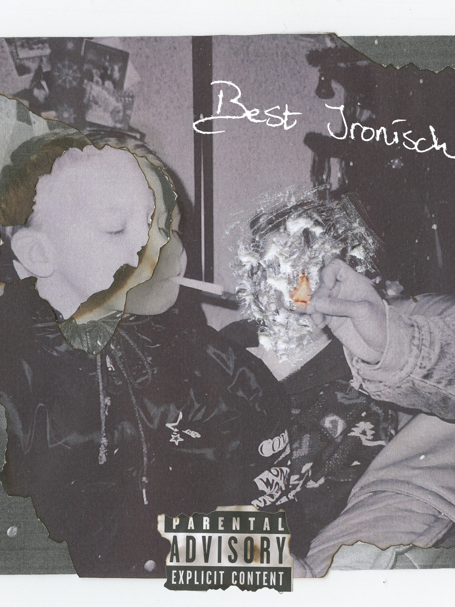
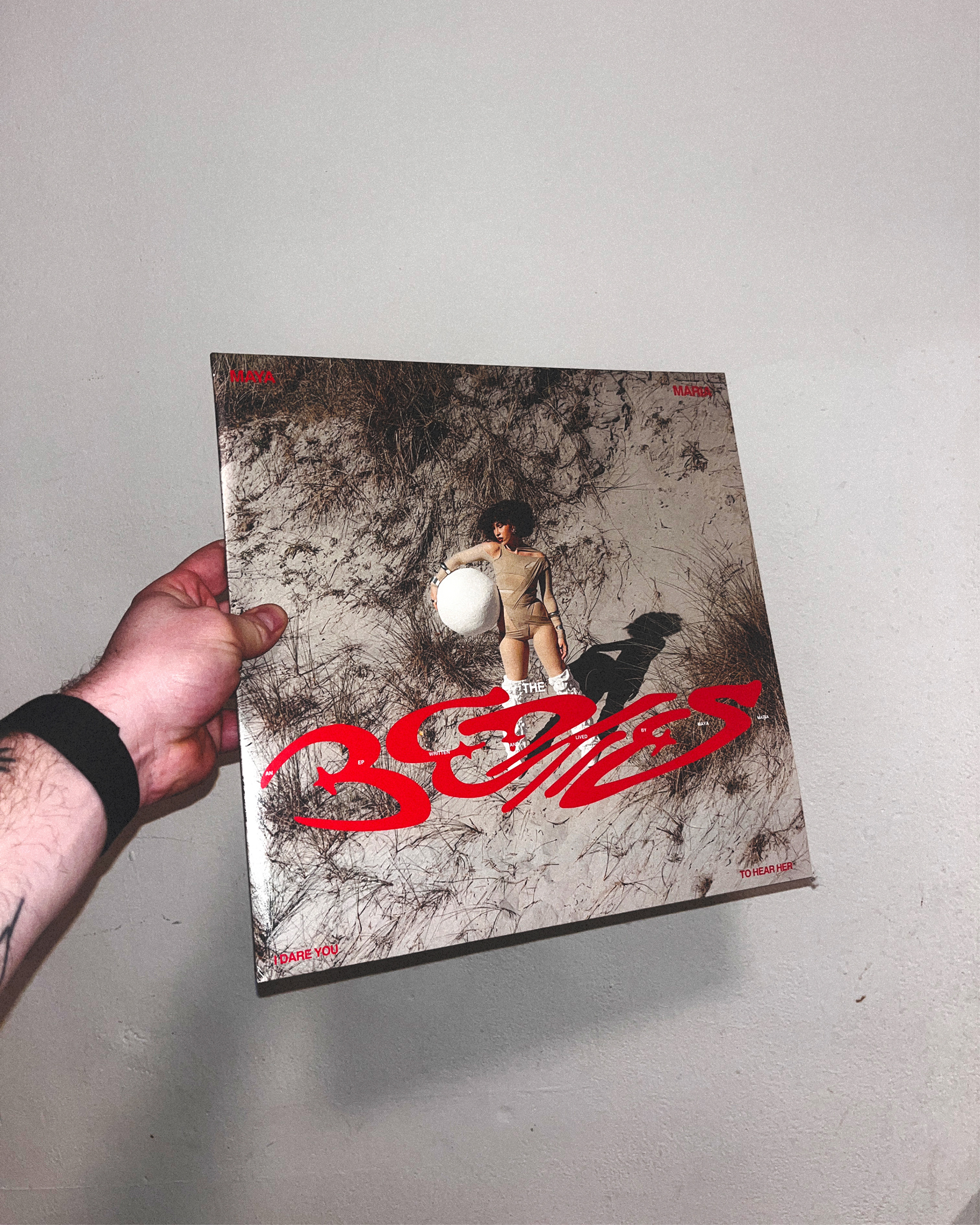
For Maya Maria’s debut, I created an evocative visual world grounded in raw emotion and physicality. Her first EP, The-bed-ties, became the anchor for a bold title logo one that ties her past to her present, quite literally. The word bed is fused with ties, symbolising her period of being bedridden and the emotional knots that came with it.
For Maya Maria’s debut, I created an evocative visual world grounded in raw emotion and physicality. Her first EP, The-bed-ties, became the anchor for a bold title logo one that ties her past to her present, quite literally. The word bed is fused with ties, symbolising her period of being bedridden and the emotional knots that came with it.
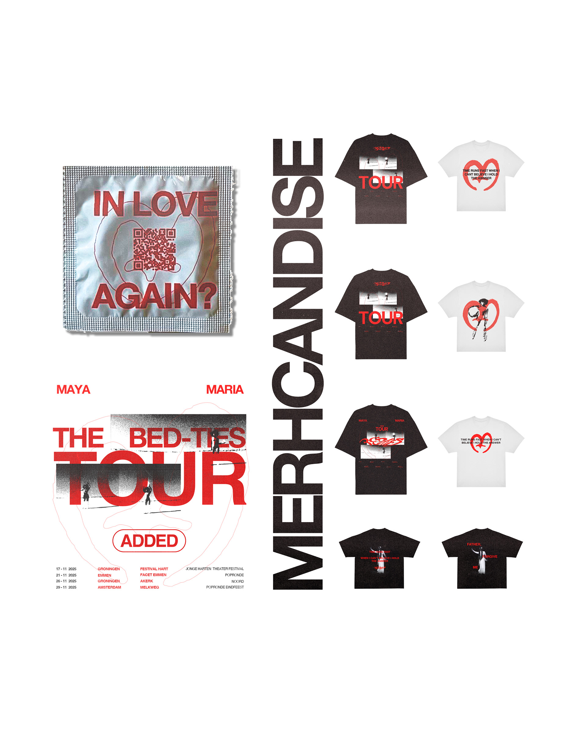
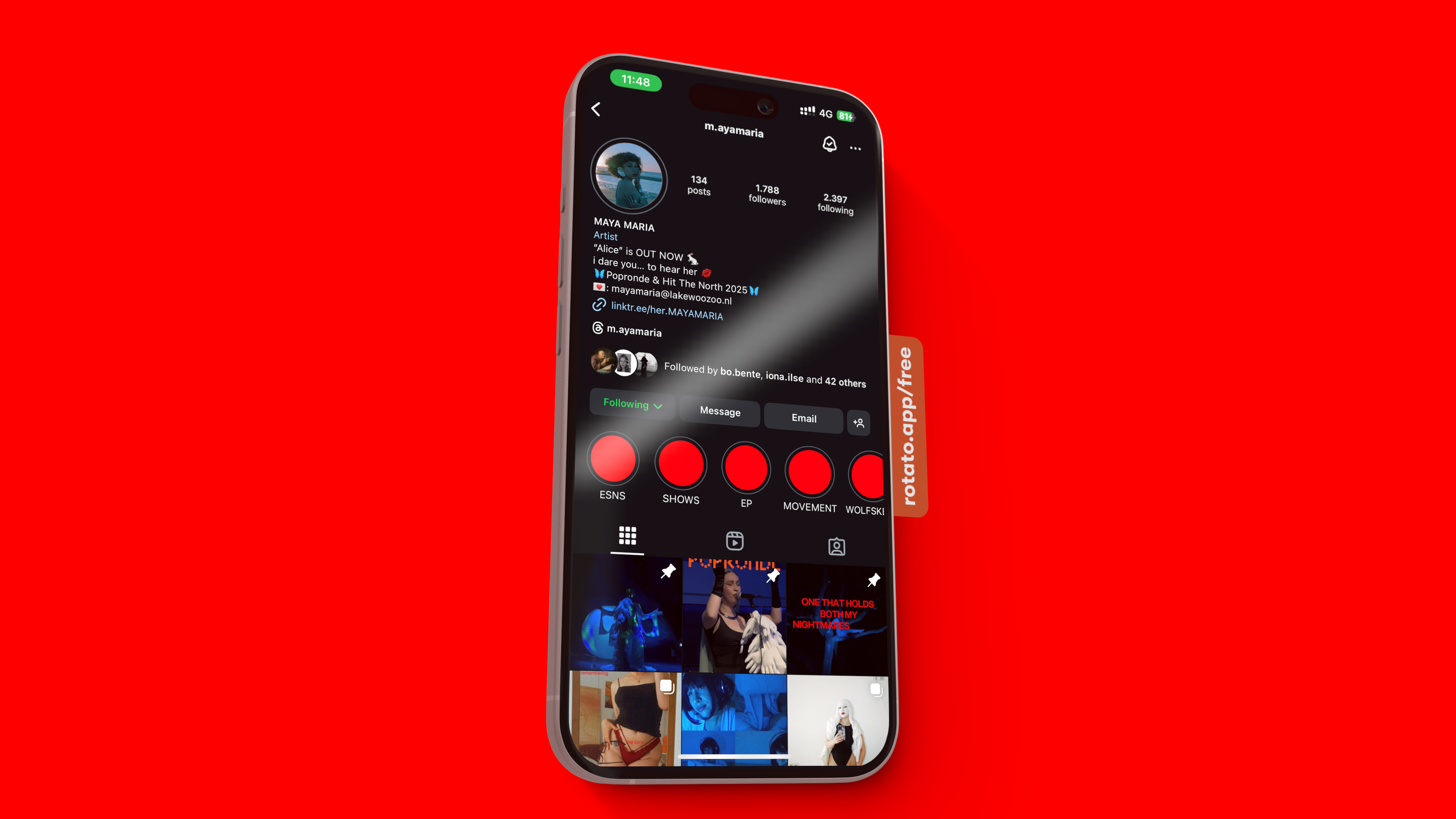
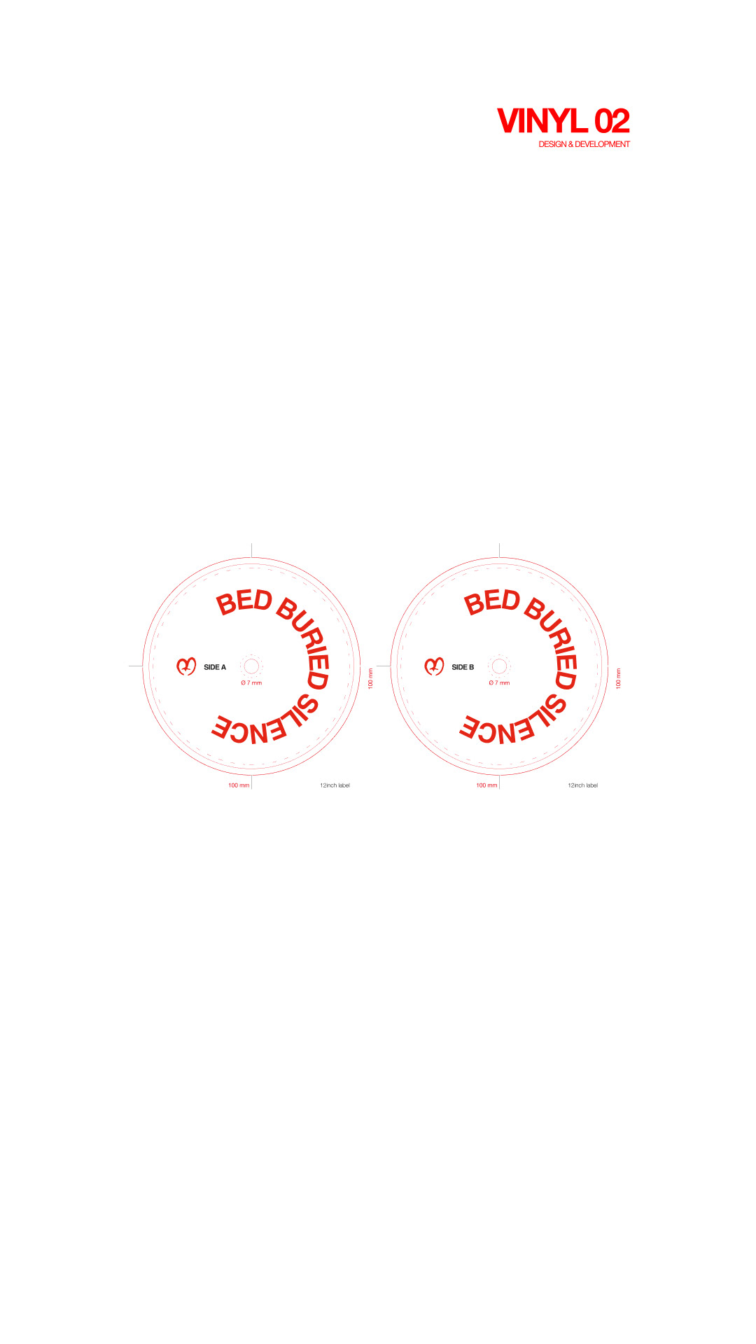
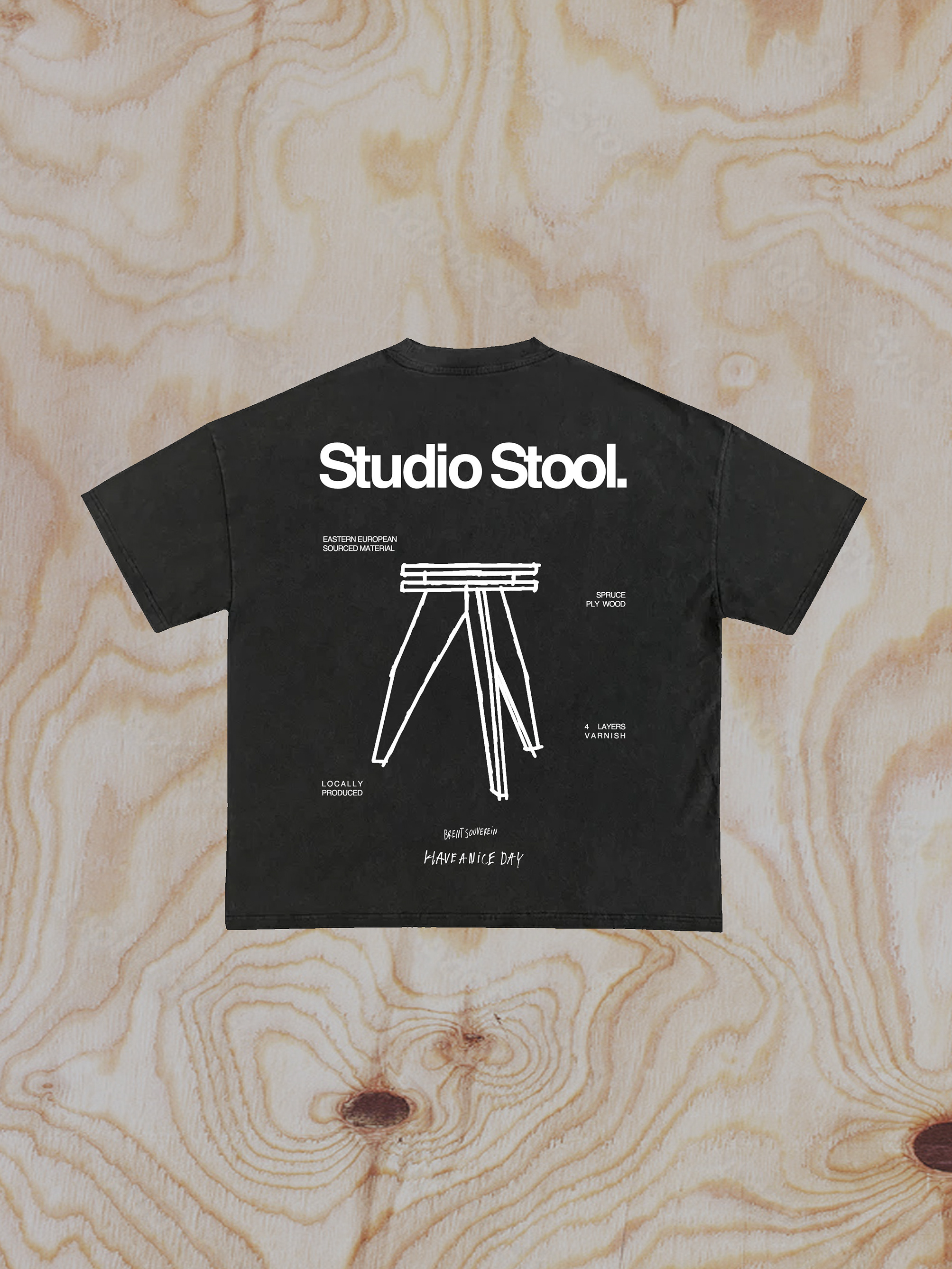
We took a physical-first approach, sketching and crafting the logo by hand. This resulted in a distinctive logomark and a standalone ‘M’ symbol both expressive, imperfect, and deeply personal. The unique letterforms evolved into a consistent typographic identity, now woven through all her touchpoints: from social media to merchandise and beyond.
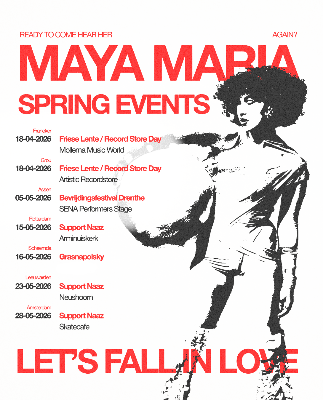
To complement the hand-drawn aesthetic, we introduced a supporting typeface that’s bold and solid enough for platforms like Instagram and TikTok, yet subtle enough to let her story shine. As Maya’s discography grew, the branding adapted each EP echoing the same visual DNA while still carving out space for its own narrative. What emerged is more than a look, it’s a language.