
The Idea
The redesign builds upon TOPH’s existing typographic foundation while giving the brand a fresh visual direction. Giving them a complete new but personal icon elevated the brand to a stronger recognizable level, but the wordmark was carefully refined and paired with new typography to create a more contemporary and distinctive identity.
The redesign builds upon TOPH’s existing typographic foundation while giving the brand a fresh visual direction. Giving them a complete new but personal icon elevated the brand to a stronger recognizable level, but the wordmark was carefully refined and paired with new typography to create a more contemporary and distinctive identity.
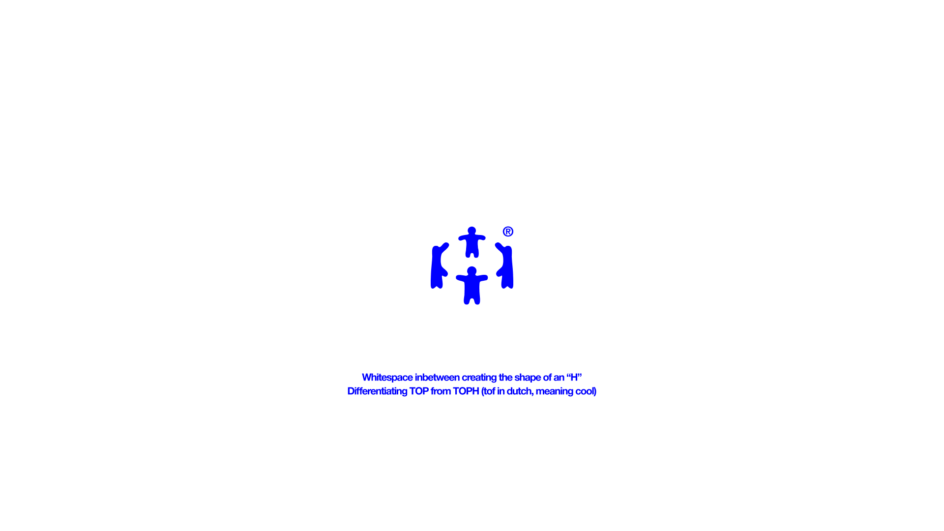
The defining feature of the logo is the angled H. Rather than being decorative, it naturally separates TOP from H, allowing the eye to briefly read TOP before completing the word as TOPH.
This creates three subtle layers of meaning:
TOP: quality, ambition, and craftsmanship.
TOF: the Dutch pronunciation, making the brand feel approachable.
TOPH: the complete brand identity.
TOF: the Dutch pronunciation, making the brand feel approachable.
TOPH: the complete brand identity.
Alongside the refreshed wordmark, a completely new brand icon was designed. Its interconnected forms symbolize the collaboration between TOPH, its clients, and creative partners, reflecting the belief that the strongest work is created together.
A Refreshed Identity
By refining the existing logo, introducing new typography, and creating a new icon, the identity feels fresh and contemporary while remaining recognizably TOPH. The result is a clearer, more confident, and more memorable brand.